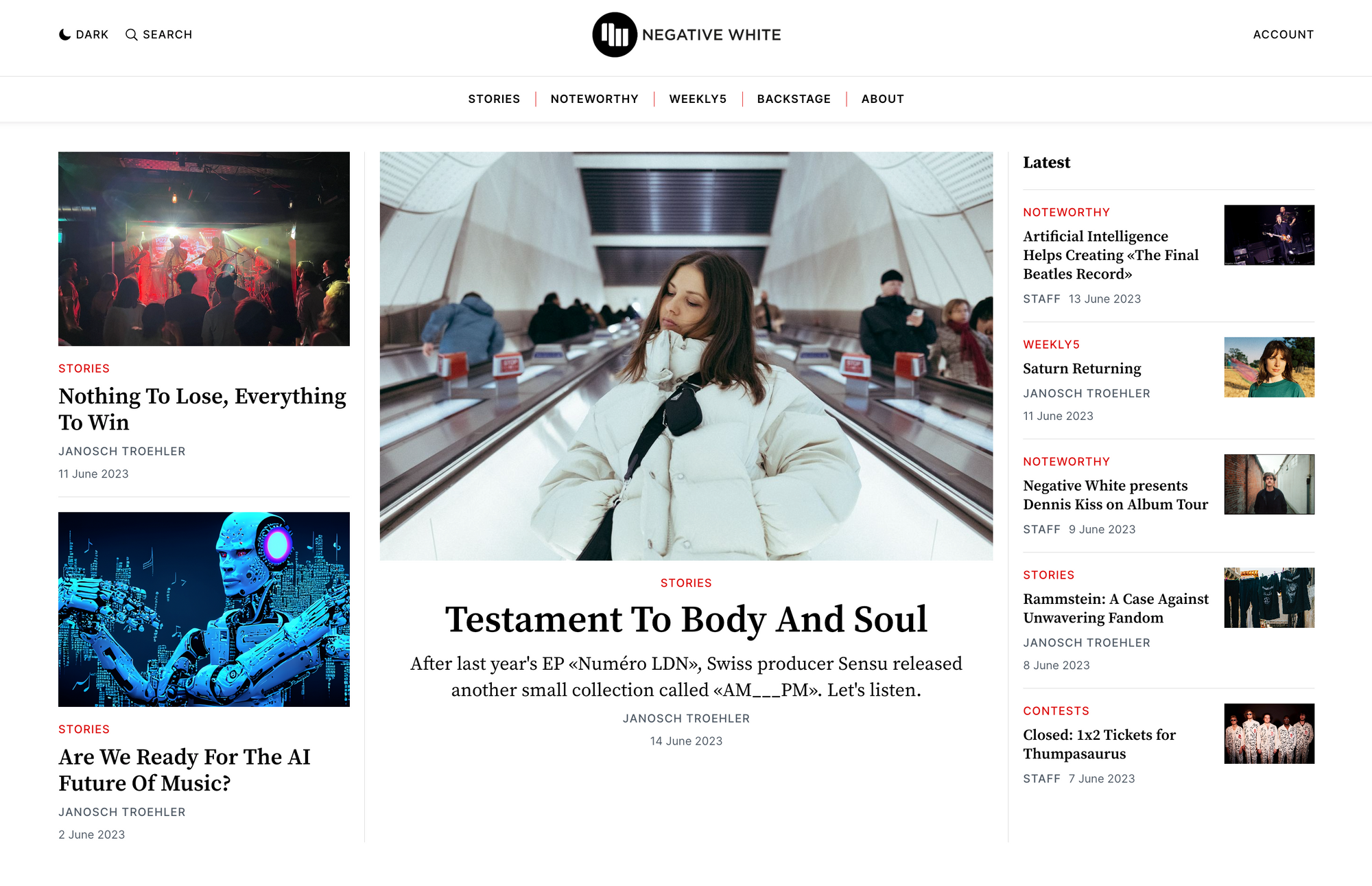
You may have noticed something different about our site if you've been here before. We've made some changes to ensure that our visitors get the best possible experience and can easily find the wealth of content we offer.
You'll be pleased to know that as a valued reader and subscriber, there are some helpful features that you can take advantage of.
Dark Mode
Some people like to read in dark mode—especially later in the day. You can now easily switch between light and dark modes by tapping the moon or sun icon on the top of the page.
Sharing
If you enjoyed one of our stories and wanted to share it, the experience was painful: The only option was to copy and paste the URL. Now, our articles feature sharing options for several popular social media sites and messengers.

As we strive to provide high-quality written and visual reporting around music, the music business, and their relationship to society at large, the design of our website should reflect the said goal.
The new design balances structure and white space with more subtle but playful elements to provide a great experience.
While we could go down a more exuberant, experimental road, we consciously opted against it. The purpose of a visual design—at least in the context of a content platform like Negative White—is to provide as little distraction as possible: no flickering animations, no fancy special effects.
In that sense, our website now presents itself in a rather traditional yet clean way.
We hope you appreciate and enjoy Negative White's new look.


